Cereal
Killer
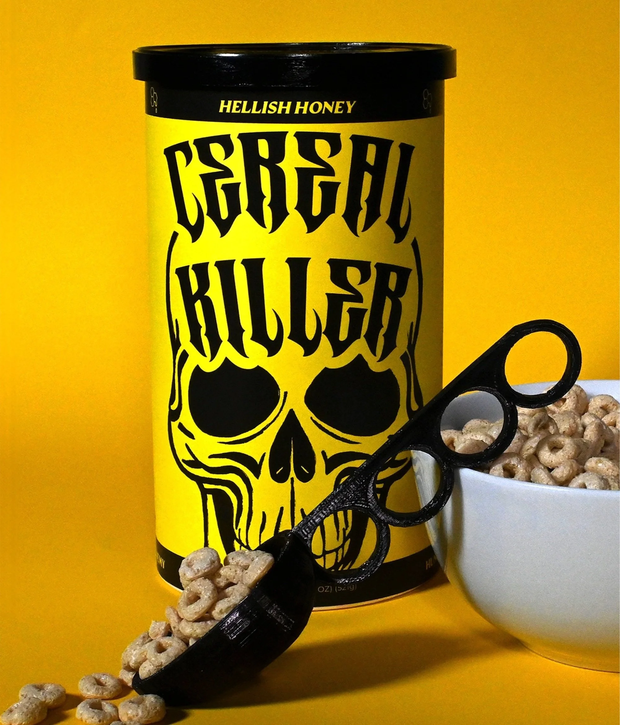
The objective of this project was to infuse a lively, contemporary twist into the package design for dry goods. Teaming up with two classmates, we embarked on the creation of "Cereal Killer." Our brand concept was anchored in an exceptionally fulfilling cereal engineered to sustain your sense of fullness. Collaboratively, we brainstormed and developed the brand name, crafted branding elements, devised compelling wording, and fashioned the package design to embody our vision. Enjoy this case study, from research to final design, for a glimpse into my process and creative journey.
We used AI to generate initial concepts for our skull illustration, experimenting with different prompts to quickly explore a wide range of styles. These AI-generated images served as inspiration for refining our final illustration.
Below, you'll see how we initially explored a wrapped canister as a potential new cereal box format but later returned to the traditional box style for the final design.
As a team, we explored typography that would establish Cereal Killer as the hardcore, rule-breaking cereal it is. We wanted a logo that felt bold, edgy, and daring—something that would demand attention next to the playful, traditional cereal boxes on the shelf. The sharp, commanding blackletter typeface became the perfect fit, evoking a rebellious attitude, while the supporting serif font for our tagline, “Hungers Worst Enemy,” adds a sinister yet refined contrast.
For this project, our team developed a bold, cohesive packaging system for Cereal Killer, where each flavor is differentiated through color and name while maintaining a consistent design. The Berry Bandit box (pink), Coconut Cuff box (blue), and Hellish Honey box (yellow) each use high-impact color to reflect their unique flavors while reinforcing the brand’s rebellious identity. This approach ensures strong shelf presence and recognizability while allowing for seamless expansion of the product line.
The back of the Cereal Killer box was designed to be both interactive and immersive. Through engaging elements like a Mad Libs story, a brand manifesto, and a challenge, it transforms an ordinary breakfast moment into an experience. The Mad Libs section invites eaters to step into the world of Cereal Killer, crafting their own daring tale of hunger-fueled mayhem—just fill in the blanks, dig in, and enjoy the ride.
This project was made in collaboration with designers Isabel Webre and Alina Zhang.


